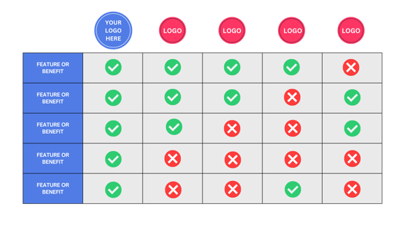
This is by far one of the most common and usually the easiest format to adhere to when presenting your competitive landscape.
Step 1: List out your most valuable features and benefits in the far left column. (ie. Affordable, Efficient, AI, Automated, etc)
Step 2: Add your company logo to the first column, and then your competitor logos to the remaining columns.
Step 3: Add a checkmark, or text to identify what features and benefits for each company.
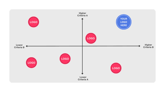
Quadrants are used to identify TWO specific criteria for cross comparison.
For example, if Criteria A = Price Point, then the top half of the quadrant is where you place logos of companies with a High price point. Companies with a low price point go to the bottom. Same directions apply to the left and right sides as well.
Step 1: Pick 2 specific criteria to compare.
Step 2: Add your company logo to the Top Right quadrant.
Step 3: Add competitor logos to the areas that make the most sense.
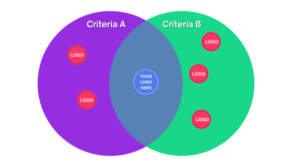
Similar to the Quadrant format, Venn Diagrams allow you to easily cross compare two specific criteria, where the end result should only show your company logo in the middle.
Step 1: Pick 2 specific criteria to compare.
Step 2: Add your company logo to the middle.
Step 3: Add competitor logos to the left and right circles.